Bridging Traditional and Digital: Community Art and Personal Practice
We’ve seen how monoline art thrives in the digital arena, but it’s equally alive in the hands of traditional artists and everyday creators. In fact, one of the strengths of the monoline aesthetic is how it bridges old-school drawing and modern tech. A uniform pen stroke on paper carries the same spirit as a uniform digital brush stroke on a tablet. This section highlights that bridge through two perspectives: first, an example of a community artist who straddles both worlds and fosters monoline art in a fandom setting; and second, my own journey transitioning from variable line art to monoline, which underscores many of the themes discussed so far.
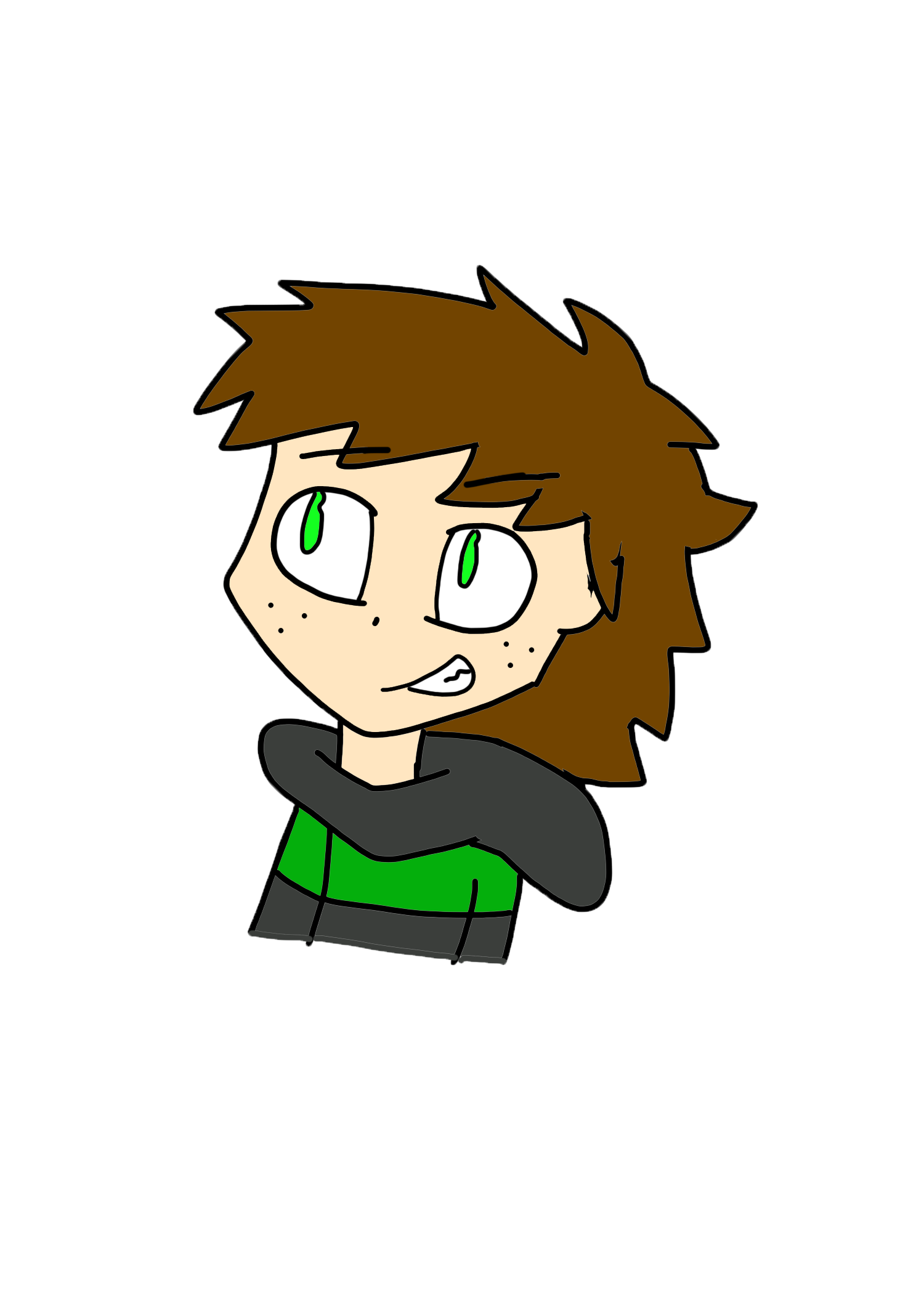
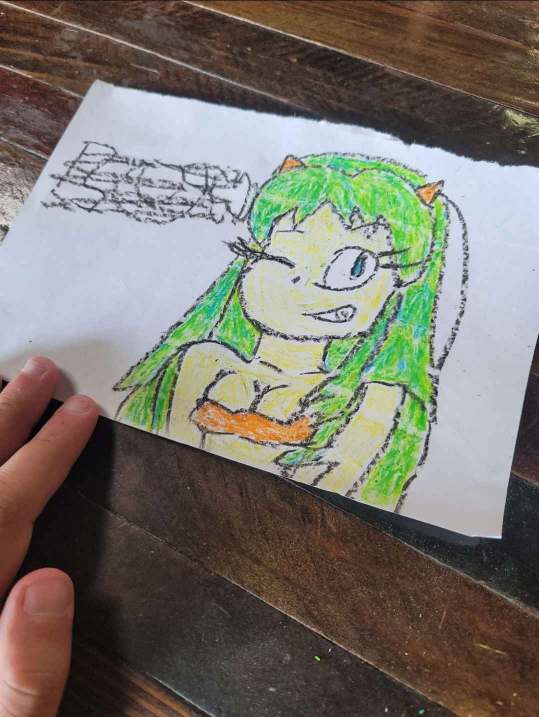
Zak – A Community Mentor: Not all champions of monoline art have massive online followings; some are influencers in a more local sense, nurturing the style within communities. Zak is one such figure! An artist and fellow Digital Sorcerer known on Discord and other platforms, respected for his clean monoline drawings and his role in encouraging fellow artists. By day, Zak often sketches with good old pen and paper, creating fan art and original characters outlined in unwavering ink lines. By night (or whenever inspiration strikes), he’ll switch to digital tools (maybe a computer with Microsoft Paint) and continue the same style digitally, often using the humble computer mouse. In doing this, Zak exemplifies how the monoline technique is fundamentally about mindset and technique rather than the medium. By mastering both, Zak reminds his peers that monoline drawing is fundamentally about technique, not just technology: whether one holds a trusty #2 pencil or an Apple Pencil, the philosophy is the same: Commit to the line and Make It Count.
Zak’s role as a Discord server owner means he also curates a space where artists share their artworks, trade tips, and encourage each other. In guiding this community, Zak emphasizes positivity and skill-building, reinforcing that drawing is something anyone can partake in with practice and patience. His personal art often references popular fandoms (from anime to video games), drawn in clean outlines that make the characters instantly recognizable yet distinctively “Zak’s style.” By maintaining that consistency across traditional and digital media, he’s built up a recognizable portfolio and a loyal circle of fellow artists. Many of his closest followers (or those he’s a fan of) have experienced the same encounter with him: he asks for their favorite character or OC they might have, and draws them on the spot to give it to them.
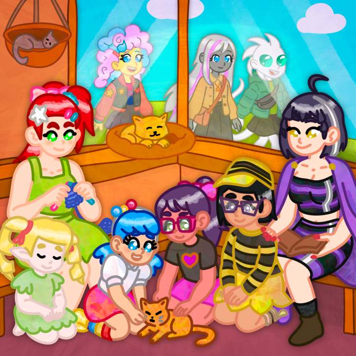
Zak’s presence in both the analog and digital art spaces, and his emphasis on positivity and sharing, illustrates that monoline art is not only a professional or commercial endeavor. It’s a grassroots creative culture! It’s kept alive by people doodling in notebooks, participating in fan art events, and trading techniques in online forums. Zak and those like him ensure that the uniform line remains a living, evolving practice passed from one artist to another. This “folk” aspect of monoline drawing reinforces why the style endures: it’s incredibly accessible and communal. In essence, Zak and those like him ensure that the uniform line remains a living, evolving practice passed from one artist to another.
My Journey – On a personal note, my own art journey resonates strongly with the patterns we’ve explored. I spent years as the kind of artist who swore by variable-width lines. I used brush pens and digital pressure settings to create tapered strokes, believing that was the key to professional-looking art. I loved how a thick-to-thin line could add visual weight or dynamism to a drawing. However, I often found myself struggling with consistency and clarity. I’d get bogged down trying to decide which lines should be thicker and sometimes scrap it entirely.
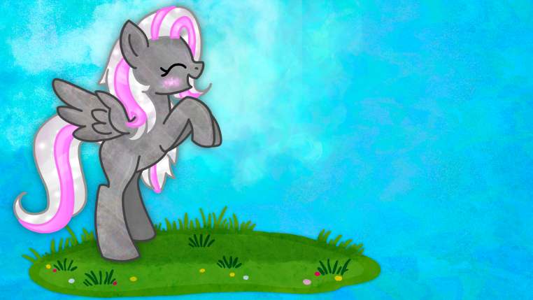
The turning point came when I encountered some striking monoline artwork online (much like the styles we’ve been discussing). It inspired me to challenge myself: could I complete a full illustration using only a single line thickness throughout? I remember choosing the “monoline” brush in procreate (which ignores pressure and draws a steady line) and sketching a scene of skateboarders at a beach. At first I focused just on outlines and shapes, resisting any urge to fancy it up. The result was a revelation: the drawing felt clean, cohesive, and readable in a way my previous work often wasn’t. It had a graphic, almost logo-like quality. More surprisingly, simplifying the line work seemed to strengthen the overall composition, as every element sat nicely in its outlined form and nothing was fighting for attention via extra-bold strokes. More importantly, I noticed the clarity: every part of the drawing was readable, and there was a new unity to it, as if all the elements were in harmony instead of competing via line weight. I proudly released the black-and-white image to my friends, even offering it as a coloring page if they wanted to fill it in.
From then on, I began retraining my hand and eye to work in monoline. It wasn’t without challenges; I had to unlearn some habits. For instance, when drawing eyes or facial features, I could no longer rely on a heavier outline to make an eye “pop.” Instead, I started to explore other ways, like making the eyes slightly larger or more stylized, using shading contrasts, or adding little graphic details. I wished to ensure important features stood out within the single-weight framework. This in turn made me more thoughtful about character design and silhouette. I also discovered little tricks, like placing two lines very close together to create the illusion of a thicker boundary (though I use that sparingly, almost like a special effect).
Adopting monoline changed my workflow too. Inking became faster and more confident. Since I wasn’t constantly switching brush sizes, I got into a rhythm of drawing smooth, deliberate strokes, almost like doing ink calligraphy but without worrying about pressure. It was liberating to focus purely on the shape of lines rather than their thickness. My hand doesn’t have fine control over how much pressure I use. The minimum lead thickness for my mechanical pencils is 1.3 mm (yes, those exist), lest the graphite snap or I tear through the paper. With my drawing app’s settings for stabilization and motion filtering set liberally, I could finally focus on smooth, predictable lines without variable line thickness bothering me.
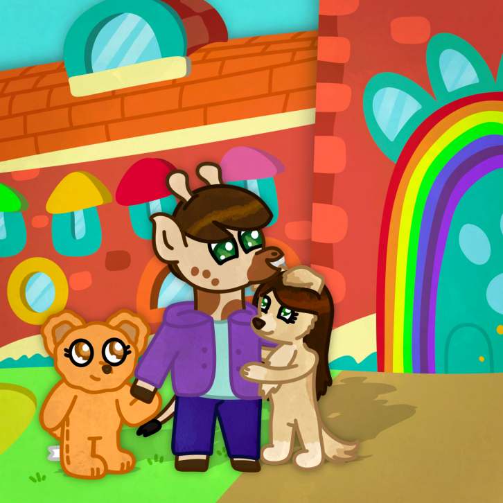
My planning process for artwork also shifted: I began to pay more attention to composition and spacing upfront, knowing that I couldn’t easily “cheat” by emphasizing an object later with a bold line. I had to plan that emphasis either by actual size or position in the composition. In a way, it made me think more like a designer, balancing black and white shapes, than just an illustrator adding lines until it looked right. And when it came to coloring those drawings, it was pure joy. Monoline outlines, if drawn with care, are like perfect little containers for color. I could drop in flat colors or gradients under the lines and the drawing would come to life, maintaining that crisp, clear look. It reminded me of making my own coloring book pages and then filling them in.
Perhaps the most rewarding part of this journey was that it connected me to a community. By sharing some of my monoline pieces on social media and in art groups, I found other artists who had made similar transitions or who simply appreciated the style, especially during Art Fight (an online art trading contest held in July). Monoline, initially, felt like I was “limiting” myself, but it ended up unlocking new creativity. I like to say now that a single steady line can speak volumes. It carries clarity (no single stroke steals the show, so the picture reads instantly), nostalgia (people often comment that my drawings feel “comforting” or remind them of childhood cartoons), and personality (paradoxically, having to work within one line width forces you to put more of your unique decision-making into the composition and form, so your style really shines through). Today, monoline art feels like my home base. I still admire artwork with lavish line variation, but I’ve learned that choosing simplicity when it suits the message is a strength, not a weakness.
In summary, bridging the traditional and the digital, and going from a full toolbox to a constrained one, has taught me firsthand that the monoline aesthetic is more than just a look, it’s almost a philosophy of art. It emphasizes fundamentals and communication over flourish. And as we’ve seen through Zak’s community and my own path, it creates connections between artists. Anyone who has ever doodled with one pen can relate, yet with practice those humble doodles can become compelling art.