The Legend Is the Argument
To understand the pronoun page, it helps to understand the legend. The color categories are actually from my favorite color palette. Not specifically the colors displayed, but their general named color is right out of the palette that started it all. The only color I was missing was purple, really. It comes from my story, Virtual World, and actually the harbinger of the term “A Virtual Girl.”
“A Virtual Girl” is my phrase for the feminine online persona/self I inhabit on the internet. It is not simply a character, a roleplay account, or a joke label; it is a real part of how I experience myself online.
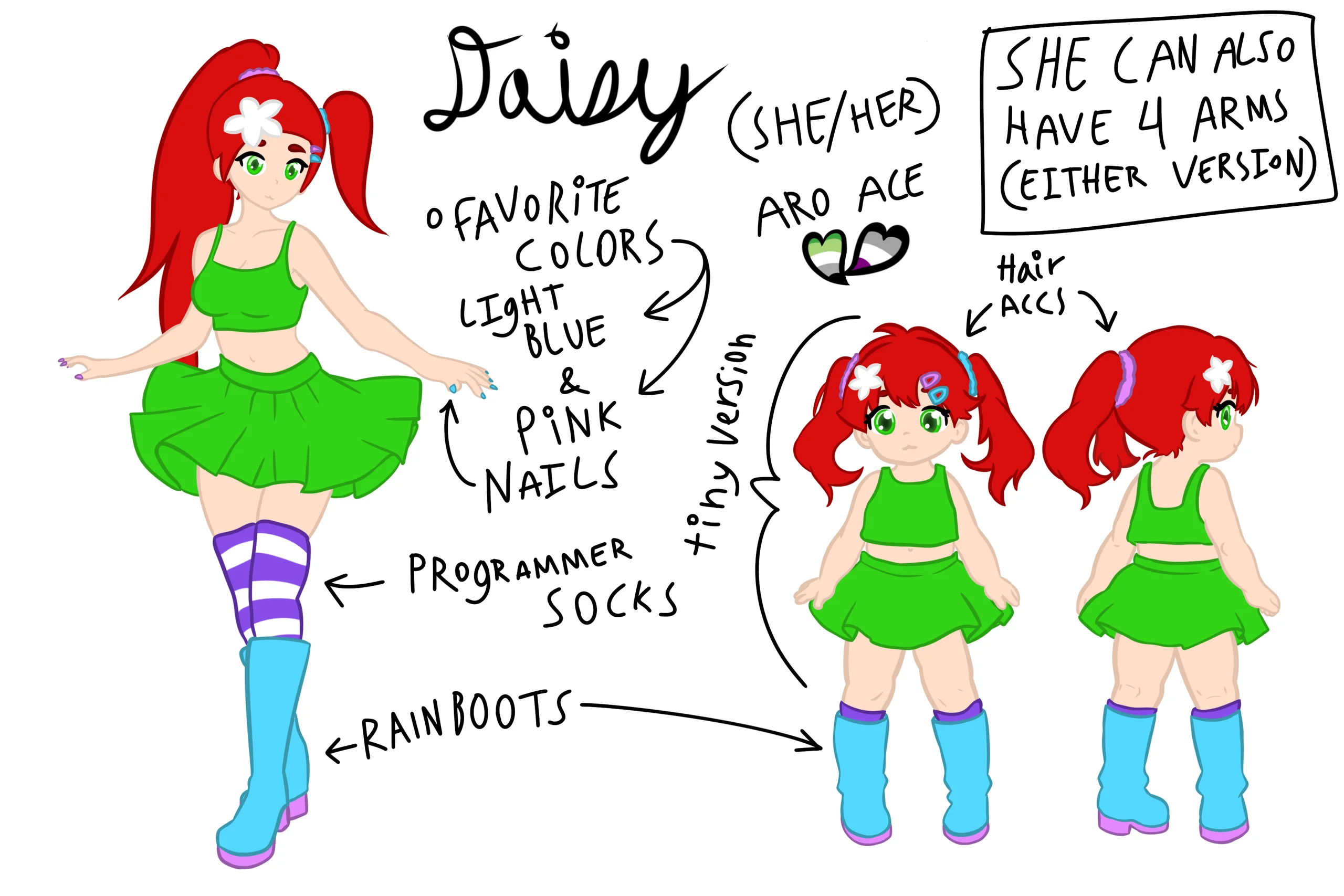
The blue, or in my story light blue, and pink are from Daisy’s accessories. That might sound minimal, but if you know character design then you know that those types of choices, made consistently, end up becoming branding. Specifically, she wears light blue accessories on the left side, such as painted nails, scrunchies, or hair clips. Then, on the right side, or central if an asymmetrical outfit but at least more to the right than what the light blue side had, she wears pink accessories like a big bow for a ponytail, and again the scrunchies, hair clips, and painted nails on her right hand. She would even hold things like two lightsabers (or copyright generic laser swords) with one shining pink and the other light blue in each respective hand. That is consistent branding, to the point that seeing another character with any accessory in that left/right arrangement in those colors makes someone go “oh Daisy!” Or maybe the left and right are swapped and they go “that’s wrong,” but playfully because it’s a different character and thus not constrained by that character design rule.
And yes, the light blue and pink are chosen specifically with the intent to convey light blue as boy and pink as girl. Yes, reinforcing that color change for masculine and feminine is a side effect, and I think pink could be, and historically has been, a masculine choice. But I was always more interested in the contrast of the colors. Daisy does not have a “feminine” or “masculine” literal side of herself. It was always the contrast between those two colors that showed the divide I wanted to show. Daisy’s character has a male body in real life within the story, but in the virtual “full dive” reality game, where the game is as real as real life, she has the girl avatar with those color choices.
And that’s just the first two colors. Green is because of Daisy’s eyes. They are bright green and exceptionally identifiable due to their brilliance. I put them as green as green can be for computer monitors at least. Since they use red, green, and blue to reproduce any color, I just do maximum green. Same with red: her hair is red, but the bright red being pure red. As red as red can go, again tying into the digitalness of her by letting it be the pure red of a display’s sub-pixels, since red, green, and blue make up three parts of a traditional pixel.
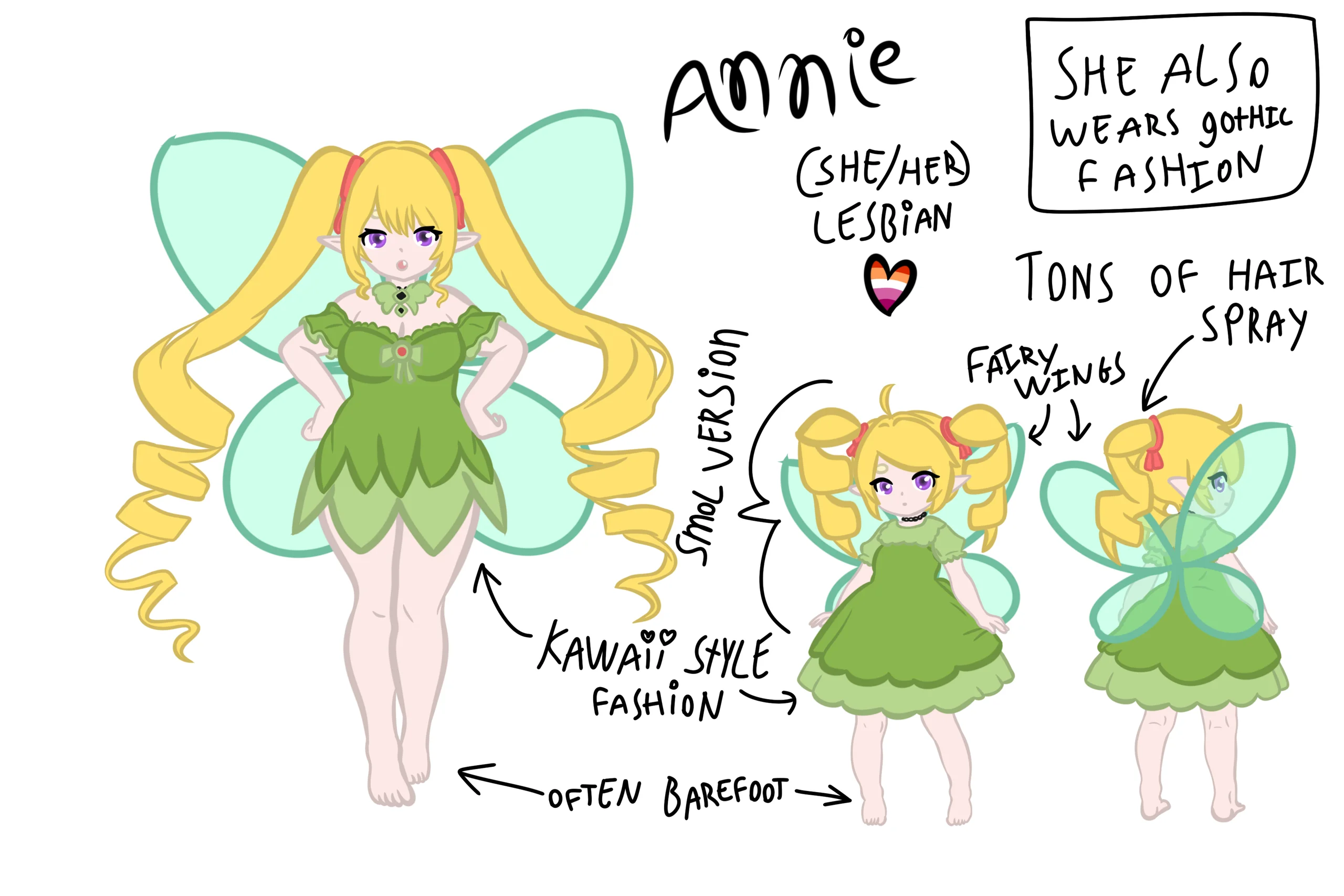
The yellow comes from another character’s color palette: Annie, Daisy’s best friend and queerplatonic partner, meaning individuals devoted to each other, outside of the traditional relationship hierarchy. More specifically, a queerplatonic bestfriendship, though that’s more of a term I made up for my own characters rather than something well documented in LGBT and queer theory. Annie’s hair is yellow, and similar to Daisy’s hair, it’s just a convenience to be associated with a stop sign, no deeper connection. Interesting that avoid and never are both hair colors, but that’s just how color palettes go. The last thing is purple. Annie’s eyes are purple, and with that color palette, that describes all of my two characters. I did not use purple in the pronoun page.
That character-color history then becomes the page’s logic. Green is also stop sign logic, because it’s terms that are always permissible, online and in person. Full go for those terms; they’re something I’m always good with.

@katsumi_maki
Words
Ways to refer to me
- boyfriend
- husband
Group terms
- throuple
Content boundaries
- Gore/Blood

Red is used in my pronoun page as “never.” Not that Daisy’s hair is never; that connection is a bit more loose. No, it’s never because red, in U.S. graphic design, signifies “stop” like a stop sign. Never is the term I use because I want people to “never bring it up.” That’s reserved for terms that I just cannot enjoy when they are used to refer to me, or conversation topics that I will never want to have with anyone, mainly connected to mental health reasons.
@katsumi_maki
Words
Content boundaries
- SA/harassment
- Self-harm
Yellow is “avoid.” It uses the same stop sign logic as a warning, as a yellow light is warning that it’s about to go red. I separate the two: the first “avoid” set of content boundaries is for words or conversation topics to either avoid or approach with caution, and the second “never” set of content boundaries is to never talk about. “Do not mention” is for the “never” options, while the “avoid” options can mean ask before mentioning, tag clearly, or only discuss seriously and carefully. They are urged to approach with caution, but it technically can be had as a conversation if done carefully.
The one uncolored legend item is “Okay,” and it’s for terms that are okay to use for me if they aren’t singling me out and are done by habit, not intent. I don’t hate hearing them, but they’re not something I would ask for. This is uncolored because it’s the default “Okay” legend item that ships with the pronoun page, and most users will recognize it and be able to connect its use with other profile pages that they have seen. Keeping it default also shows that I’m recognizing that the terms I’m listing are “default” terms, so if people do default to them, I’m still okay with it. I don’t disown or discredit these terms.
That is why skimming the page can go wrong. Someone might understand the color difference most visibly and see feminine terms in pink. Then the misunderstanding could be that I want feminine terms all the time. Really, it’s just feminine terms online.